


The 60-30-10 colour rule: how to use it and when to break the rules
Balance your colour palette with this clever trick.
Choosing the right color scheme for a room can often seem daunting, but it doesn’t have to be. You just need to learn how to use the 60 30 10 rule. It’s one of the easiest ways to create a balanced and pleasing color palette for any room.
What is the 60-30-10 rule?
It is a fundamental principle in interior design that suggests dividing a color scheme into 60% dominant color, 30% secondary color, and 10% accent color.
This helps in balancing colors, creating a visually appealing, harmonious room that’s neither too monotonous nor too chaotic.
It also allows for easy updating over time. If you decide you want to change your look, you can simply switch out your accent color with minimal hassle and expense.
How to use the rule
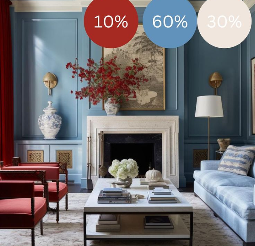
The dominant color (60%):
This is the dominant colour which sets the room’s tone and is often used on the walls, flooring or ceiling.
The secondary color (30%):
This supporting shade adds contrast and depth. It’s often used for large furniture and key accessories such as sofas, curtains, upholstered chairs or bedding.
The accent color (10%):
This is used sparingly to contrast and complement and add vibrancy and interest. Introduce this through cushions, lampshades, vases, artwork, or plants or flowers.
The dominant colour is the most important one to get right
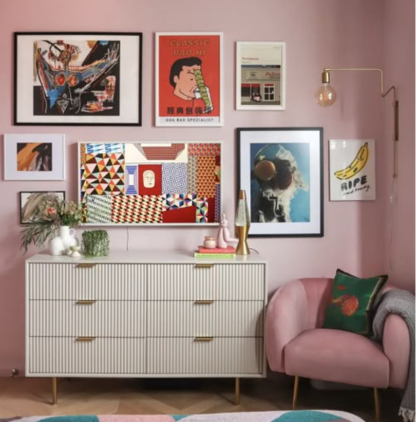
60: Pink, 30: Beige, 10: Green
Selecting a dominant colour acts as the foundation of your room so it’s important to get it right. ‘The first element of considering the 60-30-10 rule and any design scheme is to approach the walls, as they dominate an interior space more than any other component so creating interest here is key,’ advises Martin.
The accent colour should be the boldest shade
60: Beige, 30: Blue, 10: Green
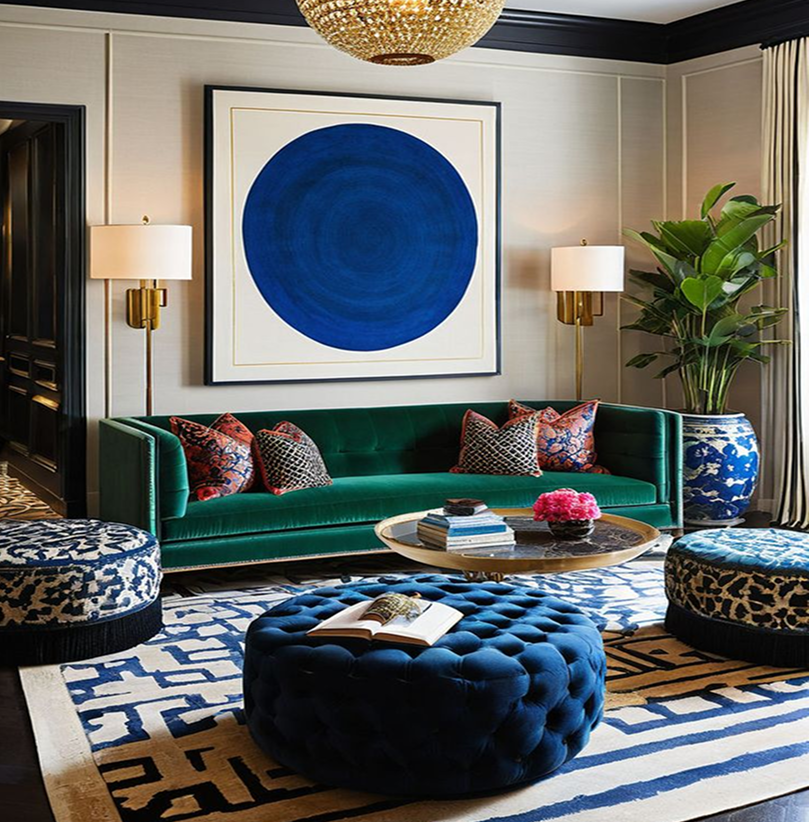
While 60 per cent is the main colour in a room, ‘the secondary colour, taking up about 30 per cent, is a bit bolder,’ says Annie. ‘You use half as much of this colour as your main colour. The accent colour is the boldest shade and takes up 10 per cent of the space.’
This rule is particularly effective when working with contrasting colours to add depth and interest to a room.
The 60-30-10 rule in action
There are several types of color schemes you can create using a color wheel, including monochromatic, complementary, split-complementary, analogous, and triadic.
Here are the definitions and some 60 30 10 rule examples for each of those color schemes.
Monochromatic colors
fromhousetohome.com
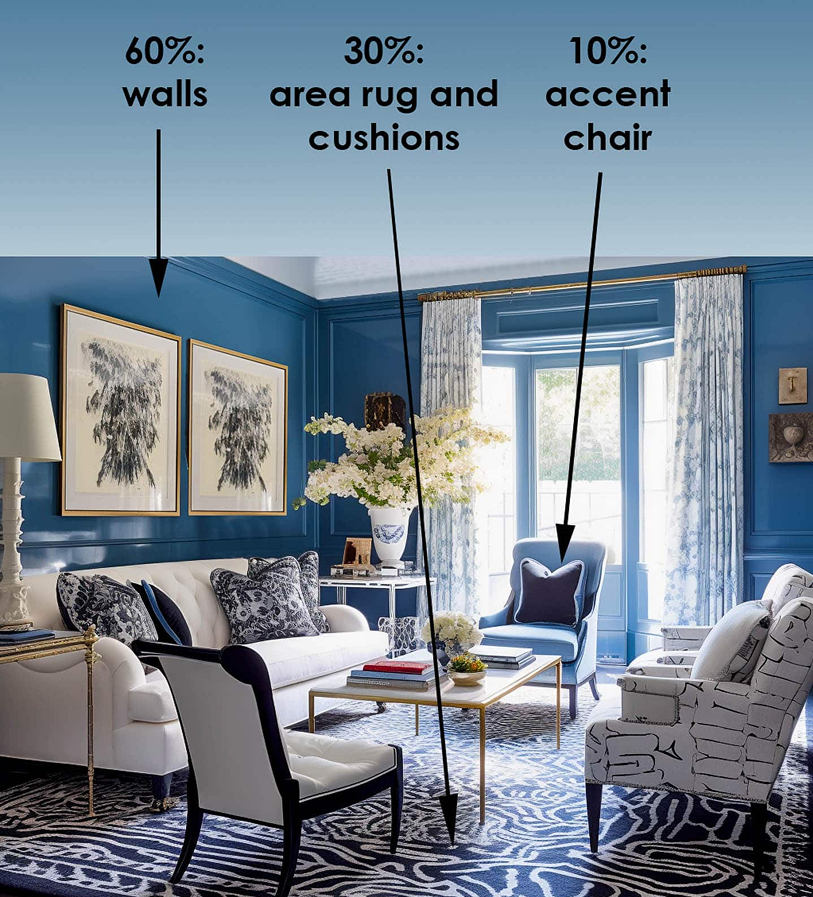
A monochromatic color scheme uses 3 different shades of the same color, such as this living room.
It has 60% medium blue on the walls, 30% dark blue in the rug, artwork and throw pillows, and 10% light blue in the chair and the pattern on the curtains.
This is a very calming color scheme that is almost guaranteed to look good regardless of what color you choose.
Complementary colors
fromhousetohome.com
Complementary colors are directly opposite each other on the color wheel, such as purple and yellow or blue and orange.
This scheme offers strong contrast and stands out the most.
To make it work for our color scheme, you’ll need to use two shades of one of the colors, like the living room above that has 60% light purple, 30% yellow and 10% dark purple.
As you can see from this example, walls aren’t always the 60% color. In this case, the ceiling, area rug and all of the furniture are done in light purple so it ends up being the dominant color.
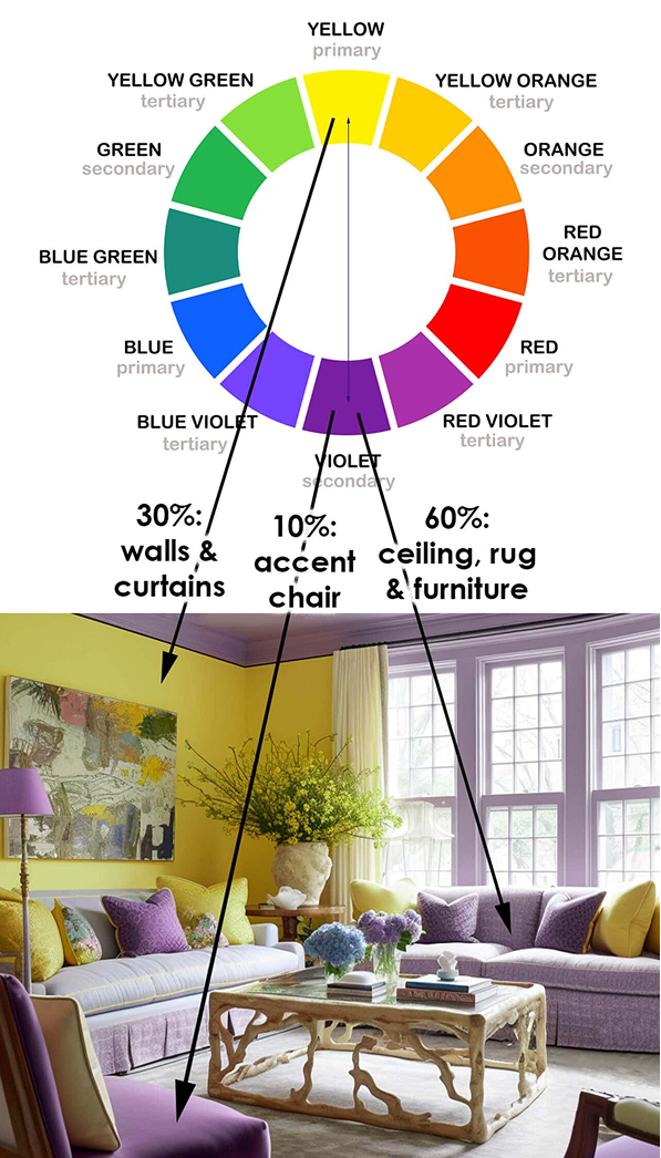
Split Complementary colors
fromhousetohome.com
Split-Complementary is a variation of the complementary color scheme that has a little less contrast but still stands out.
In addition to the base color, it uses the two colors on either side of its complement.
In this room, the base color (yellow) is the accent color while the other two colors cover most of the area.
This creates a more relaxing look than using the base color in a bigger role.
But you can select it as the dominant or secondary color if you want to add more drama to your room.
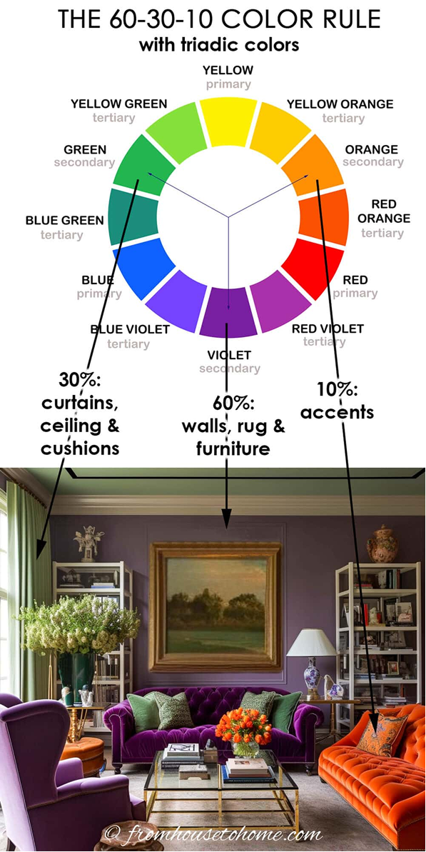
Triadic colors
fromhousetohome.com
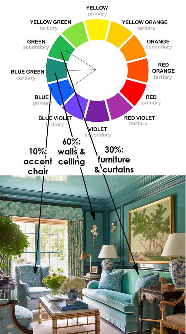
Analogous colors are next to each other on the color wheel, like blue, blue-green, and green.
This scheme is often found in nature and is gives the room a very relaxing and comfortable look.
Analagous colors
fromhousetohome.com
Triadic colors are evenly spaced around the color wheel.
This scheme is high contrast which adds a lot of energy into the room.
As you can see in this purple and green living room with a pop of orange, it definitely is not a boring room.
Color tips
Here are a few more things to think about when you are making your color choices.
Consider color temperatures
Colors are separated into warm colors (reds, oranges, yellows) and cool colors (blues, greens, purples).
Warm colors are energizing and inviting, while cool colors are calming and relaxing.
Balancing warm and cool colors in a room can also contribute to the overall harmony.
Value and saturation
Don’t forget that each color comes in a variety of shades, tints, and tones.
Changing the value (lightness or darkness) or saturation (intensity) of a color can dramatically impact its appearance and the feel of the space.
Color psychology
Remember to consider the psychological effects of colors as well.
Different colors evoke different feelings and moods.
For instance, blues are calming and relaxing, reds are energizing and stimulating, greens are peaceful and refreshing, and yellows are uplifting and cheerful.