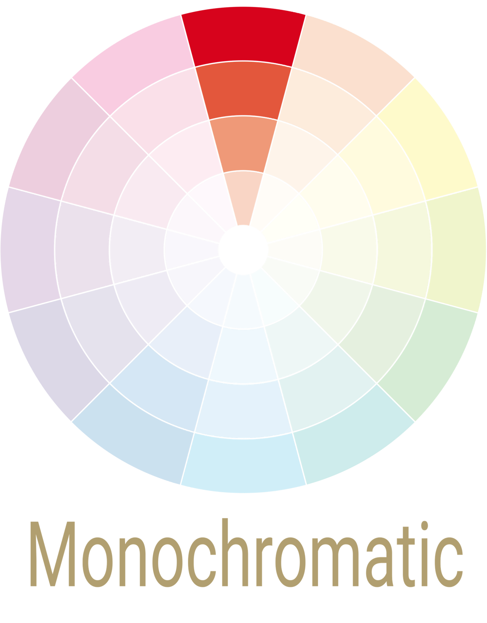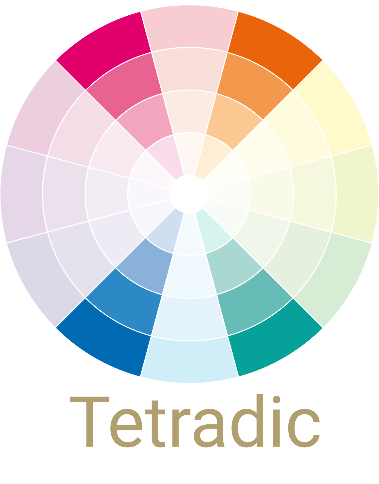


Complementery
Colour Palette
This is a color scheme with two colors that are opposite each other on the color wheel. This color scheme can be vibrant with high contrast if colors are used in the same saturation. This scheme will naturally include a warm and a cool color, as they’re on opposite sides of the wheel.
Blue
&
Orange
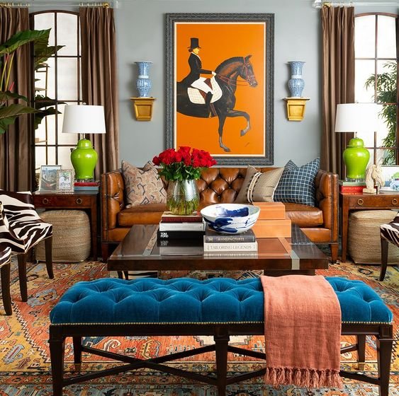
The relationship of blue and orange is certain to bring out the excitement and comfort in you. A perfect example of why opposites attract and how well they can complement each other.
Where blue in this room is the soothing or the calming element, orange is the icebreaker. The orange and the blue pattern of the ottoman, placed right in the center of the room is strikingly pretty and blends the colors used on the furniture. The neutral shades on the other hand, carefully balance the overall tone of the room.
Yellow
&
Purple
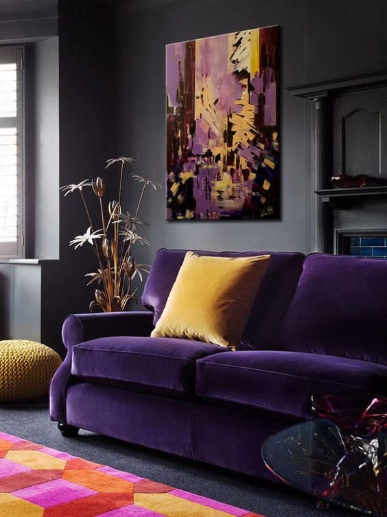
Shades of yellow and purple look good in the Spring — bold, vibrant and full of life. We understand that it can be too much to handle for some of us, but again, the thumb rule to use the right tint in the right proportion can never disappoint you. It is definitely bold and striking but the colors do great job blending in with each other. Also, notice the small yellow trays placed next to the purple chair. Every single element in this picture, from the rug to the furniture, is undeniably pleasing.
Red
&
Green
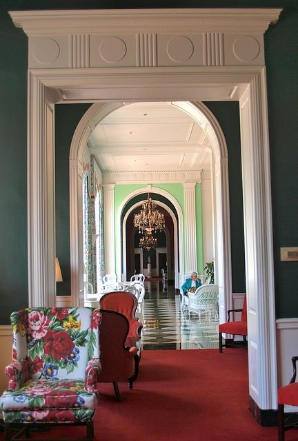
Professionals and psychologists decode green as the color of relaxation, high energy, growth and symbolic of nature. Red on the other side, emphasizes warmth and aggression. So what does such a combination look like?
Does this living room appeal to you? It doesn’t look overly festive, right? That’s because the diluted tint of green in combination with the off-white walls and additions of navy blue brings in the richness of serenity. Breaking the monotony and adding a bit of drama to this room, are the accent crimson side tables.
Recent Stories