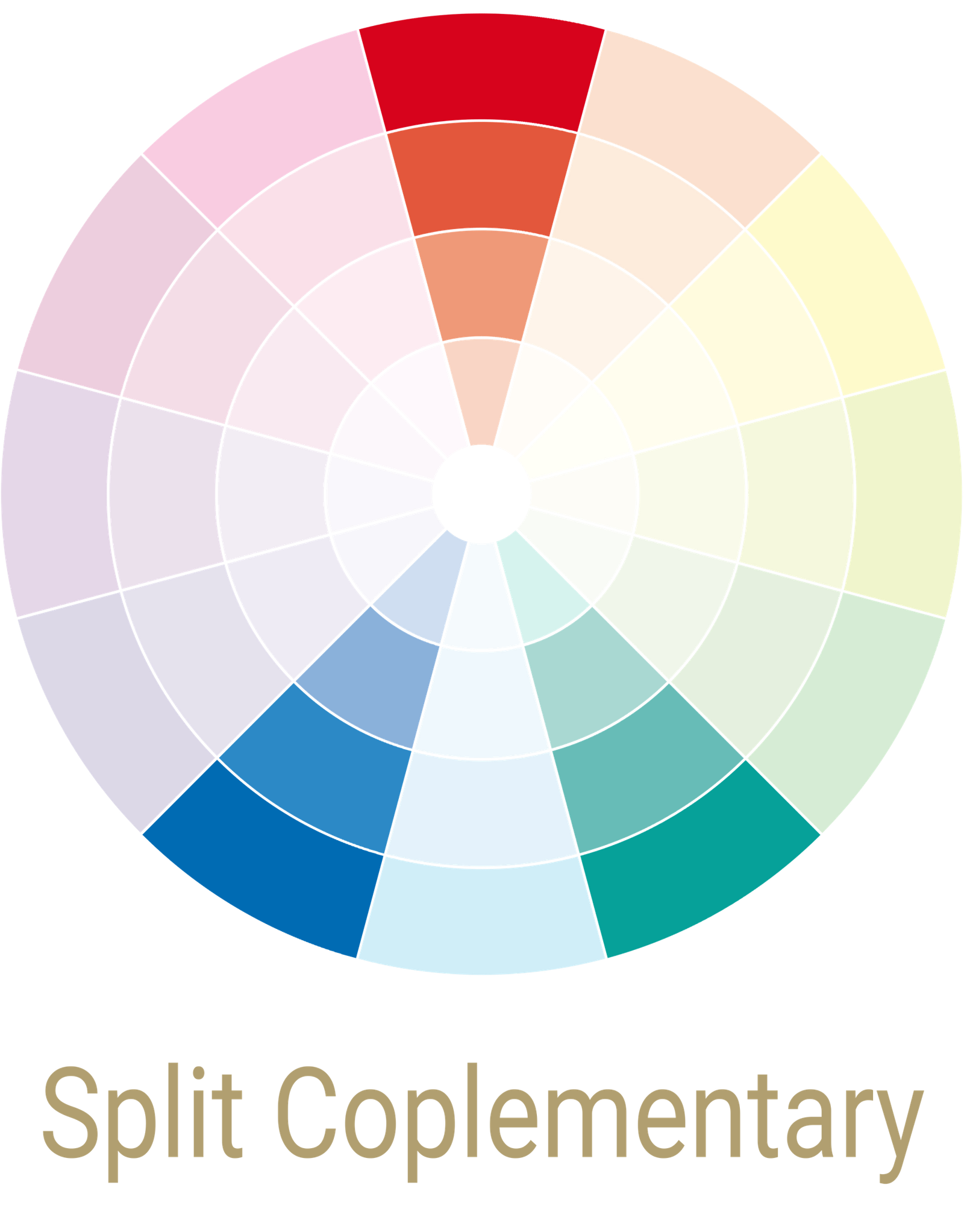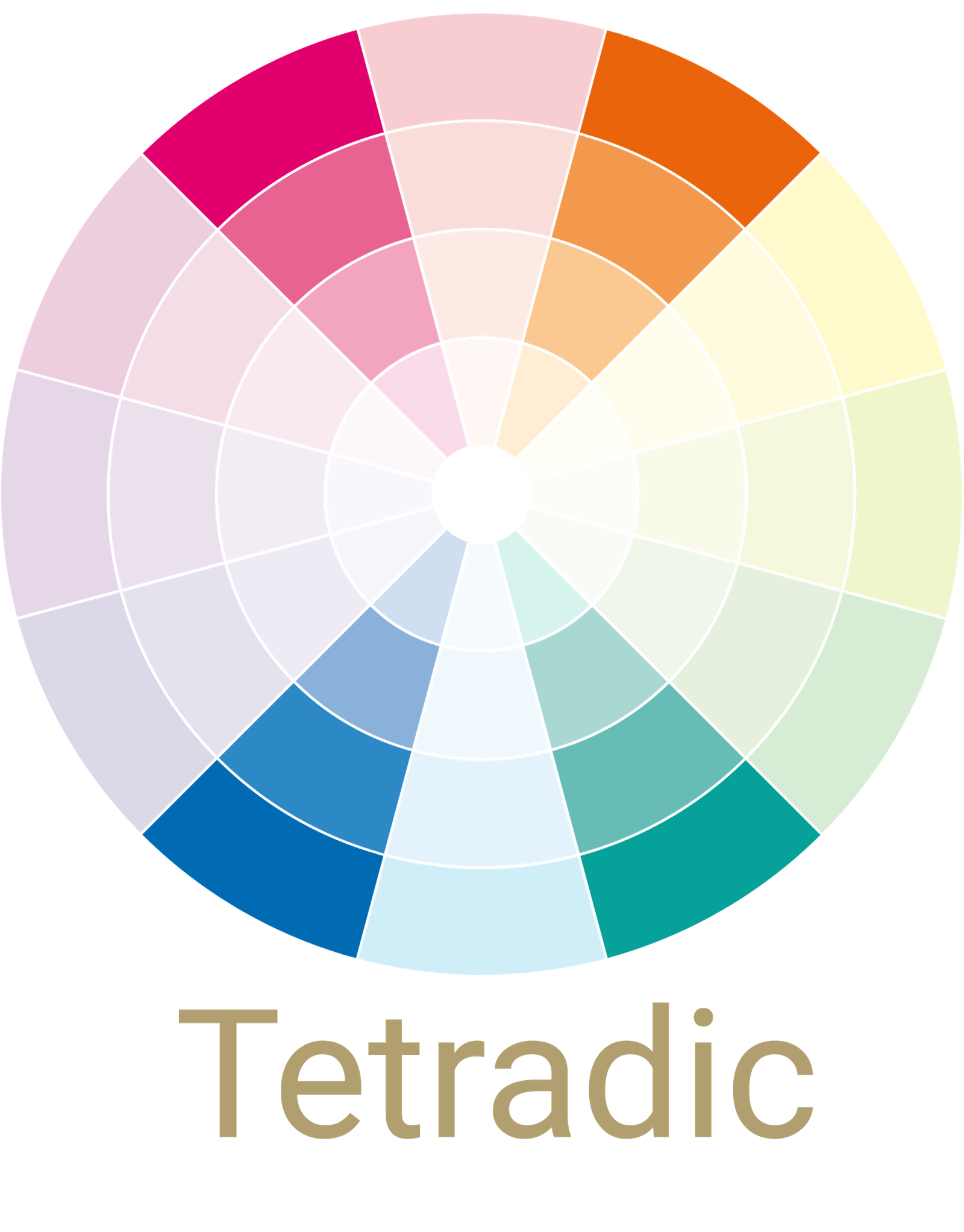


Split Complementery
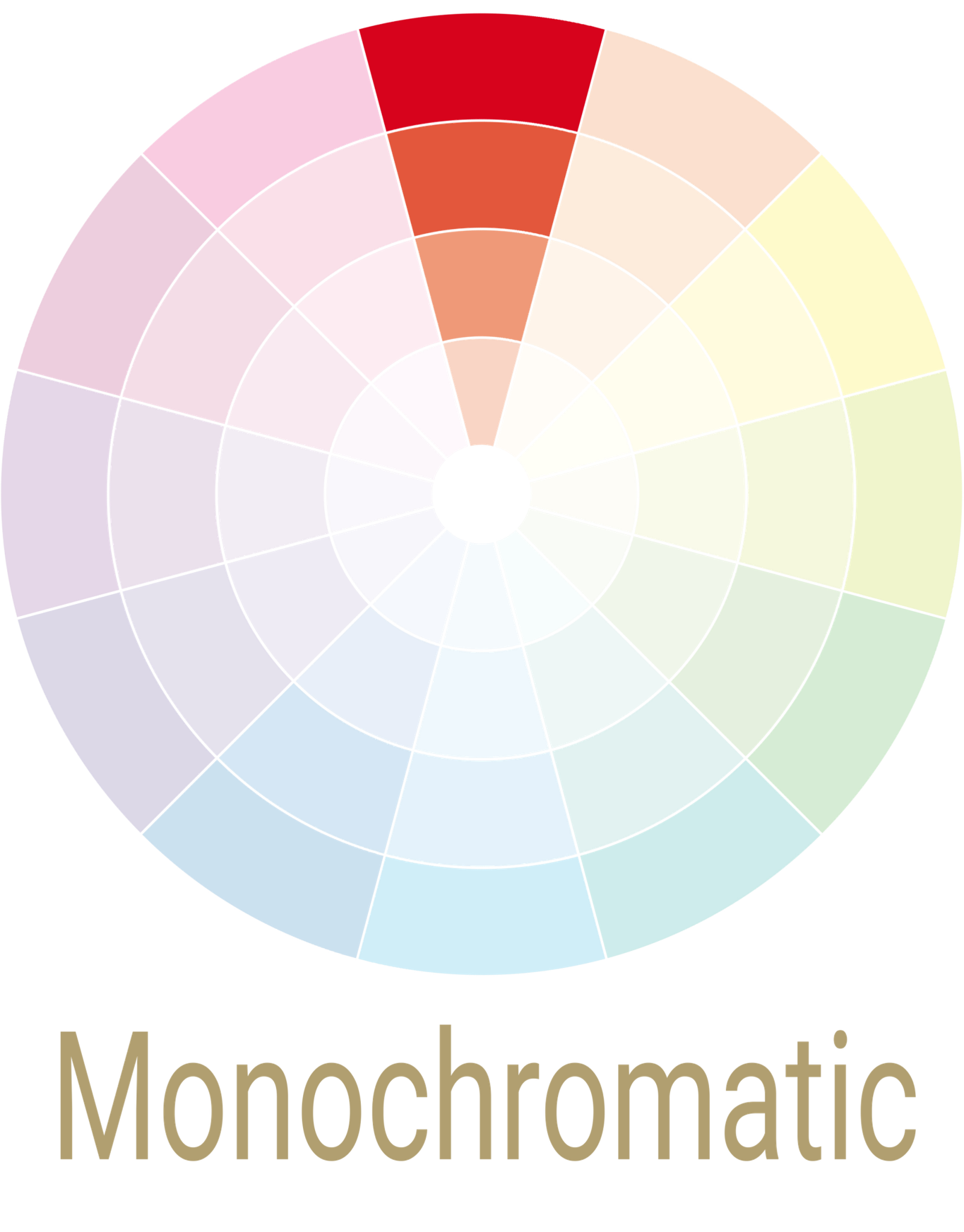
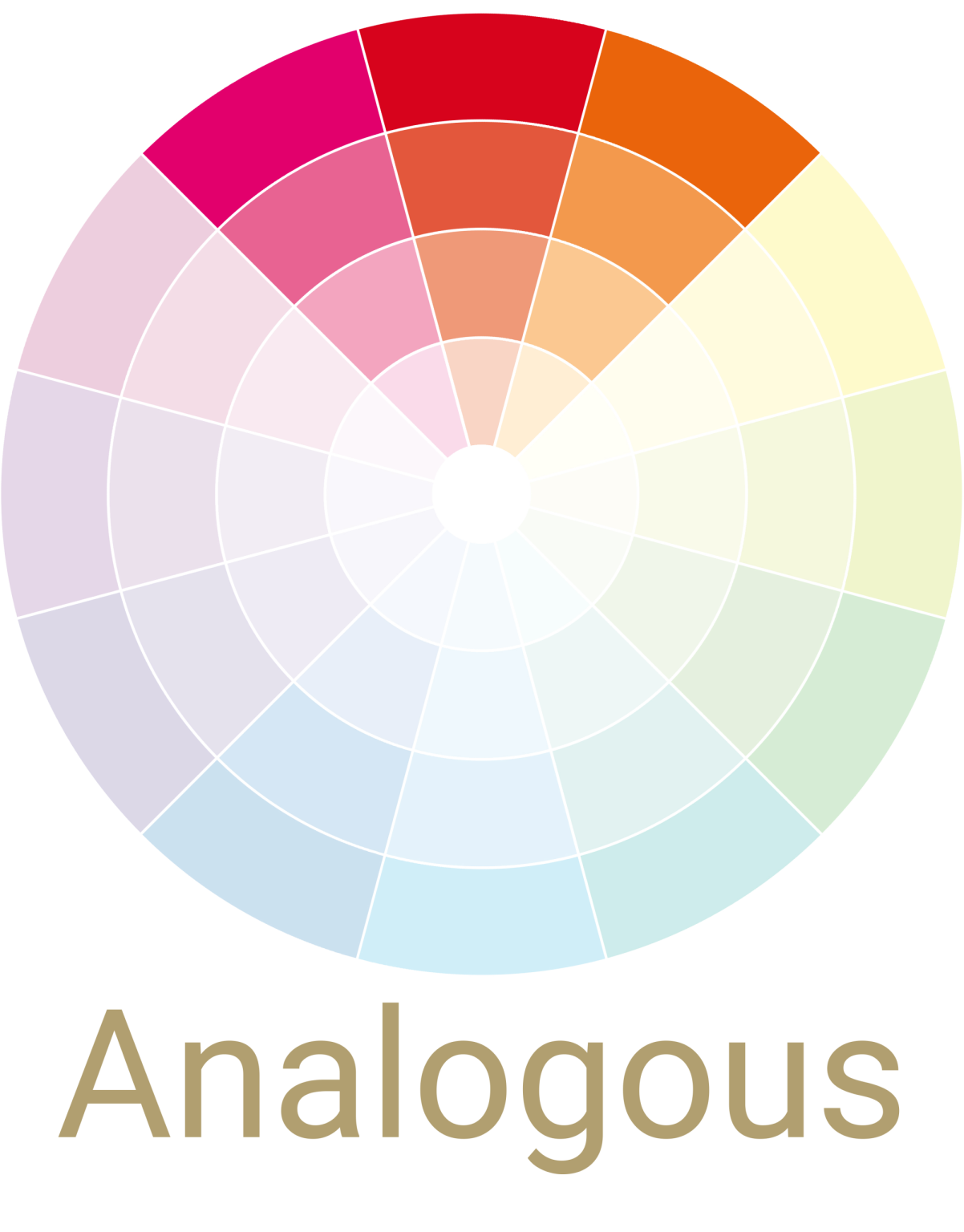
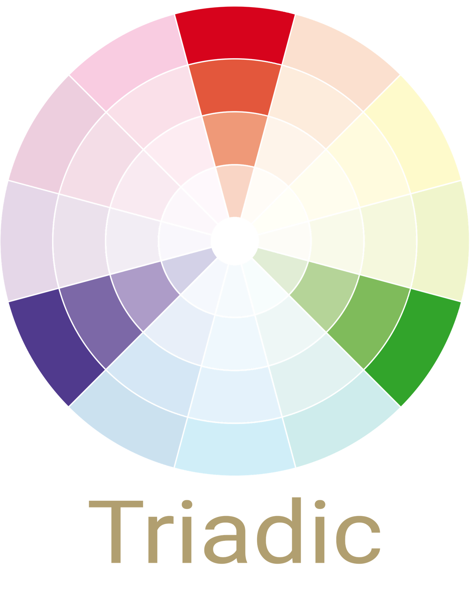
Colour Palette
This is a color scheme that uses three colors. One color is chosen first and then the colors on either side of its complementary color are included. Less dramatic than the complementary color scheme, the split-complementary is an easy color scheme to create and live with. This has two colors adjacent to each other on the color wheel, and one directly across.
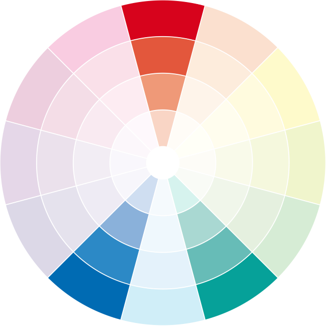
Orange
Blue-Violet
Blue-Green

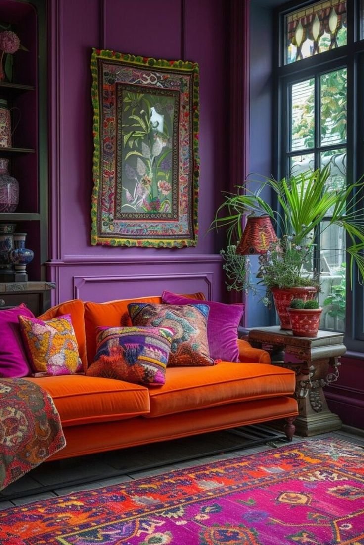
The living room is painted with bright shades of orange and blue while the third colour which is green is used in small quantities and shown through the cushions as well as with the help of plants. Another natural element is the fire which also brings colour into the room.
Yellow
Red-Violet
Blue-Violet
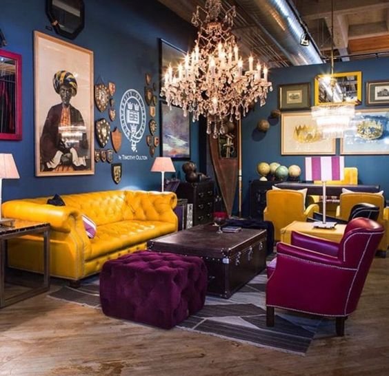
While orange and blue are the dominating colours in the room, you can notice specks of yellow in various parts or the room which are not highlighting any element but breaking the strong appeal of the orange and blue.
Yellow
orange
Blue-Violet
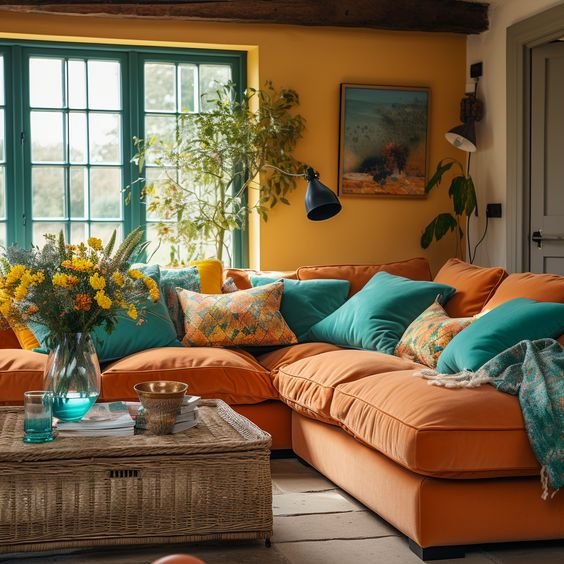
This is the magic of a split complementary color scheme.
In a living room, consider soft Yellow-Orange as the base color. Paired with accents inRed-Orange and blue, such as throw pillows, rugs, or artwork, it creates a serene yet visually interesting space.
The cool lavender contrasts beautifully with the warmth of the yellow tones, creating a balanced and inviting room.
Violet
Yellow-Orange
Yellow-Green
When you look at the picture you notice the strong use of green. To break this monotony, pink and orange are used which create a break in the line of vision and a modern look.
Recent Stories