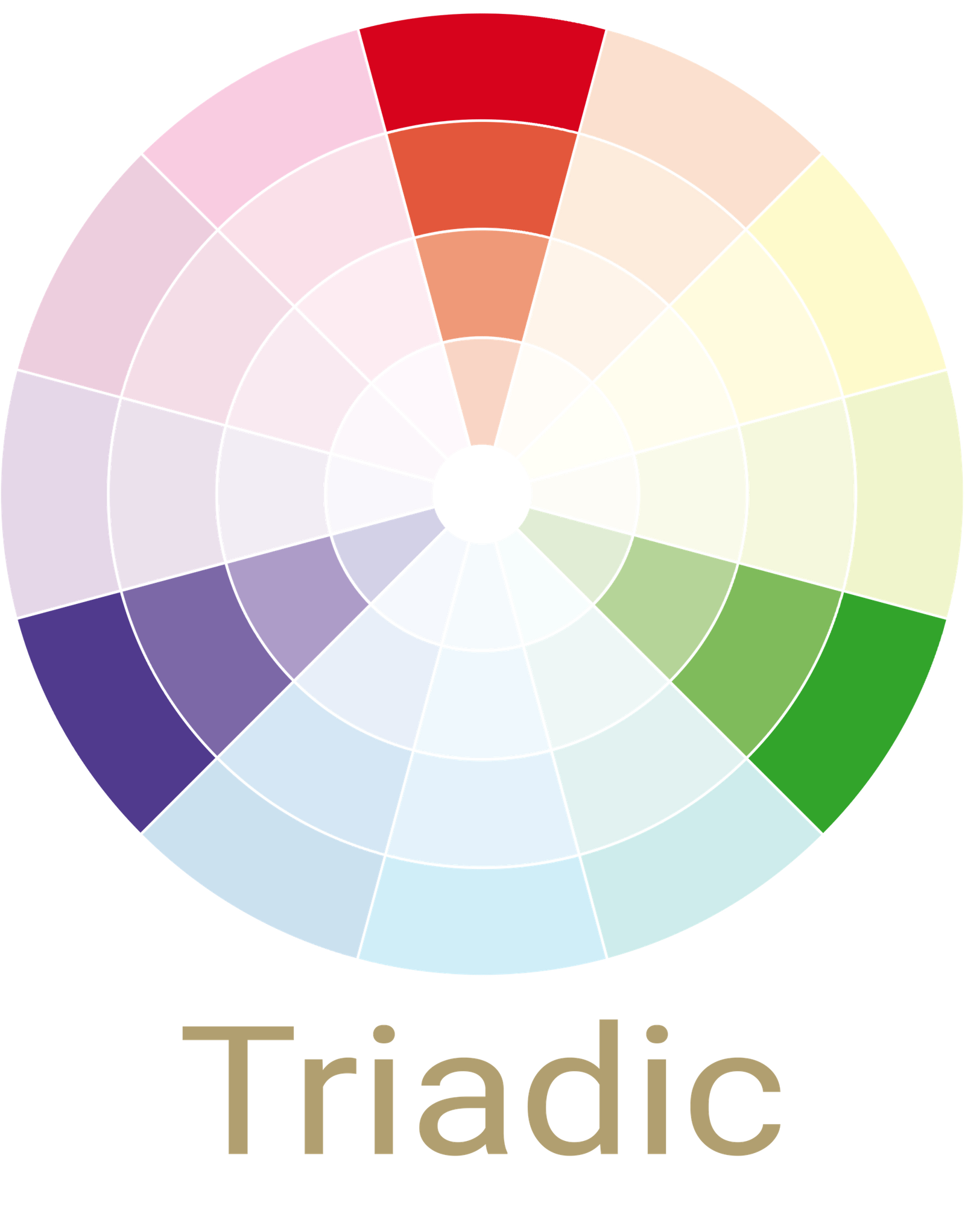


Triadic
Colour Palette

This is a scheme with three colors that are evenly spaced around the color wheel, forming a triangle. A triad color scheme could include green, violet, and orange, so care must be taken with the saturation of the colors you choose. This is another scheme that benefits from choosing one color to dominate, with the other two as accents.
Orange
Violet
Green

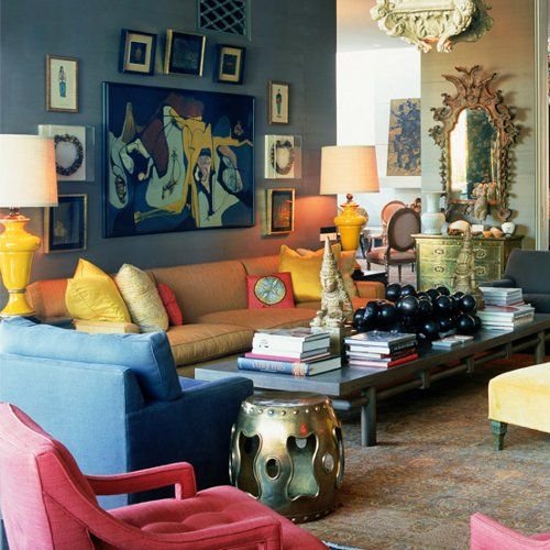
When using a bolder triadic colour scheme, interior design tricks like accent pillows and statement pieces are a simple way to update a space. Pick a neutral background and a few accents of each colour for a subtler effect. A single opulent piece of furniture can also work, playing against the neutral colour palette of the remainder of the room, and giving each hue significant impact.
Yellow-Orange
Blue-Green
Red-Violet

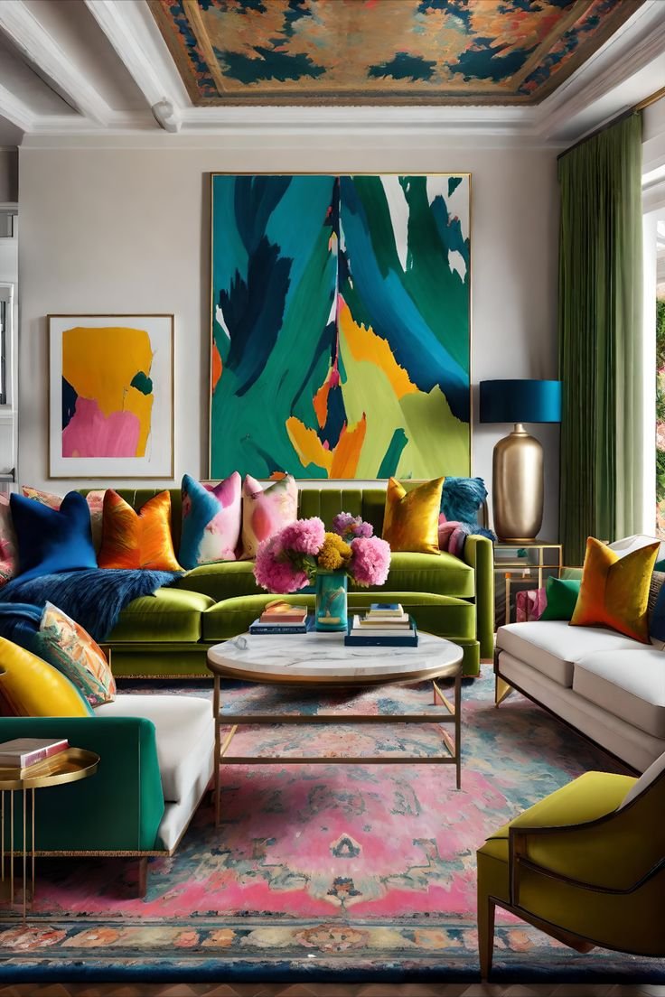
Using the tertiary colour wheel hues for your triad is a great way to establish a more contemporary eclectic feel. Working with a more complicated triadic colour palette will mean adjusting depth of hue and chroma for better balance and harmony. Embrace wide colour blocking for a bolder look, or tone down the effect by using pastel tints of the main hues.
Red-Orange
Yellow-Green
Blue-Violet
With many triadic colours, examples of decoration might tend toward an accent wall and large statement furniture. If you want to decorate with a strong, tertiary hues on the triadic colour wheel but are worried about overpowering the space, try using the less-is-more ethos. You might choose small accents of your colour triad mixed in with other neutral hues to make each colour stand out.
Red
Yellow
Blue
Remember that you don’t have to cover every inch of your room with colour when experimenting with triadic schemes. In reality, adding a few subtle colour pops to a neutral environment may make a more impactful whole. For a primary hued triadic colour scheme, interior design elements can be placed against plain backgrounds for heightened style.
Recent Stories